> ## Documentation Index
> Fetch the complete documentation index at: https://mintlify.com/gradio-app/gradio/llms.txt
> Use this file to discover all available pages before exploring further.
# Key component concepts
> Important concepts to understand when developing custom Gradio components
In this section, we discuss a few important concepts when it comes to components in Gradio. It's important to understand these concepts when developing your own component. Otherwise, your component may behave very differently from other Gradio components!
You can skip this section if you are familiar with the internals of the Gradio library, such as each component's preprocess and postprocess methods.
## Interactive vs static
Every component in Gradio comes in a `static` variant, and most come in an `interactive` version as well.
* The **static** version is used when a component is displaying a value, and the user cannot change that value by interacting with it.
* The **interactive** version is used when the user is able to change the value by interacting with the Gradio UI.
### Example: Textbox
Let's see some examples:
```python theme={null}
import gradio as gr
with gr.Blocks() as demo:
gr.Textbox(value="Hello", interactive=True)
gr.Textbox(value="Hello", interactive=False)
demo.launch()
```
This will display two textboxes. The only difference: you'll be able to edit the value of the Gradio component on top, and you won't be able to edit the variant on the bottom (i.e. the textbox will be disabled).
### Example: Image
Perhaps a more interesting example is with the `Image` component:
```python theme={null}
import gradio as gr
with gr.Blocks() as demo:
gr.Image(interactive=True)
gr.Image(interactive=False)
demo.launch()
```
The interactive version of the component is much more complex -- you can upload images or snap a picture from your webcam -- while the static version can only be used to display images.
### Components without interactive versions
Not every component has a distinct interactive version. For example, the `gr.AnnotatedImage` only appears as a static version since there's no way to interactively change the value of the annotations or the image.
### What you need to remember
Gradio will use the interactive version (if available) of a component if that component is used as the **input** to any event; otherwise, the static version will be used.
When you design custom components, you **must** accept the boolean `interactive` keyword in the constructor of your Python class. In the frontend, you **may** accept the `interactive` property, a `bool` which represents whether the component should be static or interactive. If you do not use this property in the frontend, the component will appear the same in interactive or static mode.
## The value and how it is preprocessed/postprocessed
The most important attribute of a component is its `value`. Every component has a `value`. The value is typically set by the user in the frontend (if the component is interactive) or displayed to the user (if it is static). It is also this value that is sent to the backend function when a user triggers an event, or returned by the user's function at the end of a prediction.
So this value is passed around quite a bit, but sometimes the format of the value needs to change between the frontend and backend. Take a look at this example:
```python theme={null}
import numpy as np
import gradio as gr
def sepia(input_img):
sepia_filter = np.array([
[0.393, 0.769, 0.189],
[0.349, 0.686, 0.168],
[0.272, 0.534, 0.131]
])
sepia_img = input_img.dot(sepia_filter.T)
sepia_img /= sepia_img.max()
return sepia_img
demo = gr.Interface(sepia, gr.Image(width=200, height=200), "image")
demo.launch()
```
This will create a Gradio app which has an `Image` component as the input and the output. In the frontend, the Image component will actually **upload** the file to the server and send the **filepath** but this is converted to a `numpy` array before it is sent to the user's function. Conversely, when the user returns a `numpy` array from their function, the numpy array is converted to a file so that it can be sent to the frontend and displayed by the `Image` component.
By default, the `Image` component sends numpy arrays to the Python function because it is a common choice for machine learning engineers, though the Image component also supports other formats using the `type` parameter. Read the `Image` docs to learn more.
### The two conversion methods
Each component does two conversions:
Converts the `value` from the format sent by the frontend to the format expected by the Python function. This usually involves going from a web-friendly **JSON** structure to a **Python-native** data structure, like a `numpy` array or `PIL` image. The `Audio` and `Image` components are good examples of `preprocess` methods.
Converts the value returned by the Python function to the format expected by the frontend. This usually involves going from a **Python-native** data structure, like a `PIL` image, to a **JSON** structure.
### What you need to remember
Every component must implement `preprocess` and `postprocess` methods. In the rare event that no conversion needs to happen, simply return the value as-is. `Textbox` and `Number` are examples of this.
As a component author, **you** control the format of the data displayed in the frontend as well as the format of the data someone using your component will receive. Think of an ergonomic data structure a **Python** developer will find intuitive, and control the conversion from a **web-friendly JSON** data structure (and vice-versa) with `preprocess` and `postprocess`.
## The example version of a component
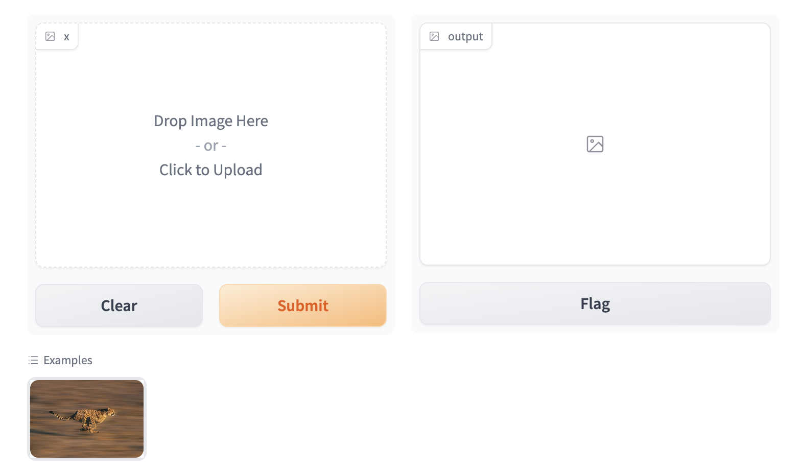
Gradio apps support providing example inputs -- and these are very useful in helping users get started using your Gradio app. In `gr.Interface`, you can provide examples using the `examples` keyword, and in `Blocks`, you can provide examples using the special `gr.Examples` component.
At the bottom of this screenshot, we show a miniature example image of a cheetah that, when clicked, will populate the same image in the input Image component:
### Implementing the example view
To enable the example view, you must have the following two files in the top of the `frontend` directory:
* `Example.svelte`: This corresponds to the "example version" of your component
* `Index.svelte`: This corresponds to the "regular version"
In the backend, you typically don't need to do anything. The user-provided example `value` is processed using the same `.postprocess()` method described earlier. If you'd like to process the data differently (for example, if the `.postprocess()` method is computationally expensive), then you can write your own `.process_example()` method for your custom component, which will be used instead.
The `Example.svelte` file and `process_example()` method will be covered in greater depth in the dedicated [frontend](/custom-components/frontend) and [backend](/custom-components/backend) guides respectively.
### What you need to remember
If you expect your component to be used as input, it is important to define an "Example" view. If you don't, Gradio will use a default one but it won't be as informative as it can be!
## Next steps
Now that you know the most important pieces to remember about Gradio components, you can start to design and build your own!
* Learn how to implement the [backend](/custom-components/backend) of your component
* Learn how to build the [frontend](/custom-components/frontend) of your component
* See [examples](/custom-components/examples) of custom components in action
This documentation is built and hosted on [Mintlify](https://mintlify.com), a developer documentation platform.